

How to Create Minimalist Designs That Prioritize Functionality
Minimalism isn’t just a style—it’s a strategy for creating products that are beautiful, intuitive, and truly useful.
witten By Siddha Aryan
May 31, 2025
Why Minimalism is the Secret to Timeless Design
Minimalist design is everywhere, from iconic tech products to the world’s most popular apps. But minimalism isn’t just about less—it’s about making every detail count. When you strip away the unnecessary, you reveal the essential. The result? Interfaces and experiences that are easy to use, visually calming, and focused on what users really need. In a world overloaded with information, minimalism offers clarity and purpose.
The Principle: Function Over Form
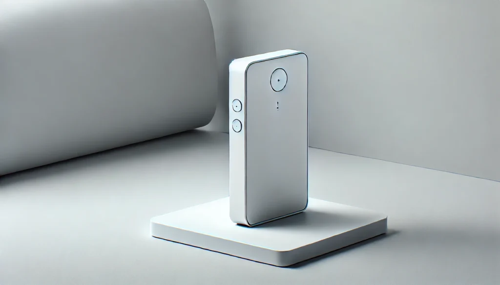
At the heart of minimalist design is a relentless focus on functionality. Every pixel, word, and interaction should serve a clear purpose. This doesn’t mean your design has to be stark or boring—on the contrary, minimalism can be elegant and warm. The key is to ensure that beauty never comes at the expense of usability. When you design with function in mind, you create products that stand the test of time.
Start with the Essentials: Define the Core Purpose
Every successful minimalist design begins with a deep understanding of its purpose. Ask yourself:
-
What is the main problem this design solves?
-
What is the single most important action I want users to take?
List out all possible features, elements, and content. Then, ruthlessly prioritize. Keep only what directly supports your core goals. For example, an app for booking appointments should make scheduling effortless—everything else is secondary. By focusing on essentials, you create a clear path for users and eliminate confusion.
Tips:
-
Use user stories and journey mapping to clarify priorities.
-
Test early prototypes with real users to see what’s truly necessary.
Whitespace: The Unsung Hero
Whitespace (negative space) is more than “empty” space—it’s an active design tool. It separates content, improves readability, and draws attention to key actions. In minimalist design, generous whitespace helps users focus and prevents visual fatigue.
How to use whitespace effectively:
-
Group related elements together and separate unrelated ones.
-
Use margins and padding to create breathing room around buttons, text, and images.
-
Don’t be afraid of “empty” areas; they help guide the eye and create a sense of calm.
Example:
Apple’s website is a masterclass in whitespace, making products stand out and navigation effortless.
Color with Intention: Less is More
A limited color palette is a hallmark of minimalist design. Too many colors can overwhelm users and dilute your message. Instead, choose a small set of harmonious colors—typically one primary, one accent, and neutral backgrounds.
Best practices:
-
Use color to signal importance (e.g., a single accent color for calls to action).
-
Ensure sufficient contrast for accessibility.
-
Avoid gradients and textures unless they serve a clear function.
Example:
Instagram’s direct messaging interface uses mostly white and gray, with blue as an accent for new messages and actions.
Typography: Clarity and Hierarchy
Typography in minimalist design is all about clarity and order. Choose one or two highly legible fonts. Use size, weight, and spacing to establish a clear hierarchy—so users know what’s most important at a glance.
How to get it right:
-
Use larger, bolder text for headings; smaller, lighter text for details.
-
Maintain generous line spacing for readability.
-
Avoid decorative fonts that can distract or reduce legibility.
Pro tip:
Test your design in grayscale to ensure hierarchy is clear even without color.
Purposeful Elements: Every Detail Matters
In minimalist design, every visual element must justify its existence. Buttons, icons, and images should have a clear reason for being there—no filler, no fluff.
How to achieve this:
-
Audit your design for unnecessary graphics or features.
-
Use icons only when they add meaning or improve navigation.
-
Replace decorative images with purposeful visuals, such as product shots or instructional diagrams.
Case in point:
Google’s homepage is famously minimal, with just a logo, a search bar, and two buttons—everything else is secondary.
Minimalism Makes Products Intuitive
By focusing on what matters most, minimalist designs help users accomplish their goals quickly and without distraction. This leads to higher satisfaction, fewer errors, and stronger brand loyalty.
Minimalism isn’t about doing less—it’s about doing what matters, better. When every element is intentional, your design remains relevant, effective, and beautiful for years to come.
Minimalism isn’t about doing less—it’s about doing what matters, better. When every element is intentional, your design remains relevant, effective, and beautiful for years to come.